Here's the completed happiness newspaper article!
Approved!
Happiness website, get ready for an explosion of pink that's so freaking happy you won't even be able to stand it!
http://jow505.wix.com/happiness
Approved!
Monday, February 18, 2013
Sunday, February 10, 2013
Zombie Academy


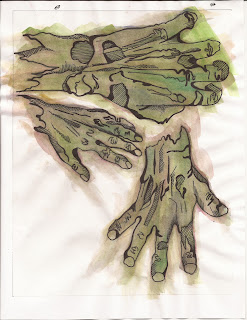
And we have zombie hands!
I think I need to rework the text.
So Here's the revision. I pretty much reworked the whole thing. I think with the more muted background it makes the text much more prominent but there might still be some work that needs to be done.RErerererereRevised!
And the final product is... bum ba da da! The hand touching the banner and lots of blood!
Approved
Lots o' blood for you Rusty, and oh the logo isn't backwards and up side down and there isn't stuff running off the page and stuff...oops!
and to top it all off, a kick butt website complete with blood splatters!
Tuesday, February 5, 2013
Herpetology Club
So, I feel like there will be revisions to me be made but as a first draft, I like how this one turned out. The concept is "find your way" and the snakes make a maze from the top of the page to the bottom.
This is my most favoritest piece ever because it got the red OK without any revisions being made! BEST DAY OF MY LIFE! However I did add one more little snake because I thought it needed one :)
Website for Truman State University Herp Club!
http://jow505.wix.com/herpetology-club
Grab the popcorn, because its movie time!
This is my most favoritest piece ever because it got the red OK without any revisions being made! BEST DAY OF MY LIFE! However I did add one more little snake because I thought it needed one :)
Website for Truman State University Herp Club!
http://jow505.wix.com/herpetology-club
Sunday, February 3, 2013
Summer Excurtion
A summer course focused on the the big rocks of the Tetons and other national park natural features, "Rock On." To create the background I layered various textures and images along with vector graphics that have been blended together.
 |
| So now the mountain is popping and there's a lot more going on with the text. "Rock On" now pops for Rusty. Approved Here's the link to the cool webpage! http://jow505.wix.com/tetons1 Approved! |
Friday, February 1, 2013
Blahhh
So I now know that I hate trying to figure out how design a website. I think I need to have a little more direction than just being told how to essentially open a new document in Dream Weaver before I dive into trying to make a whole website. I'm starting to figure out how to use the templates a little bit but can get much beyond getting basic text into the document; I can't figure out how to change the sidebar colors to do much text editing.
Subscribe to:
Comments (Atom)


