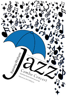
And here the Jazz poster is with type on it. I also included a gradated drop shadow behind each of the music notes; I 'm not sure how I feel about that part yet but we shall see.
Ya...that's better.
My first animation to be posted on the blog!
Approve me!
Newspaper Ad


